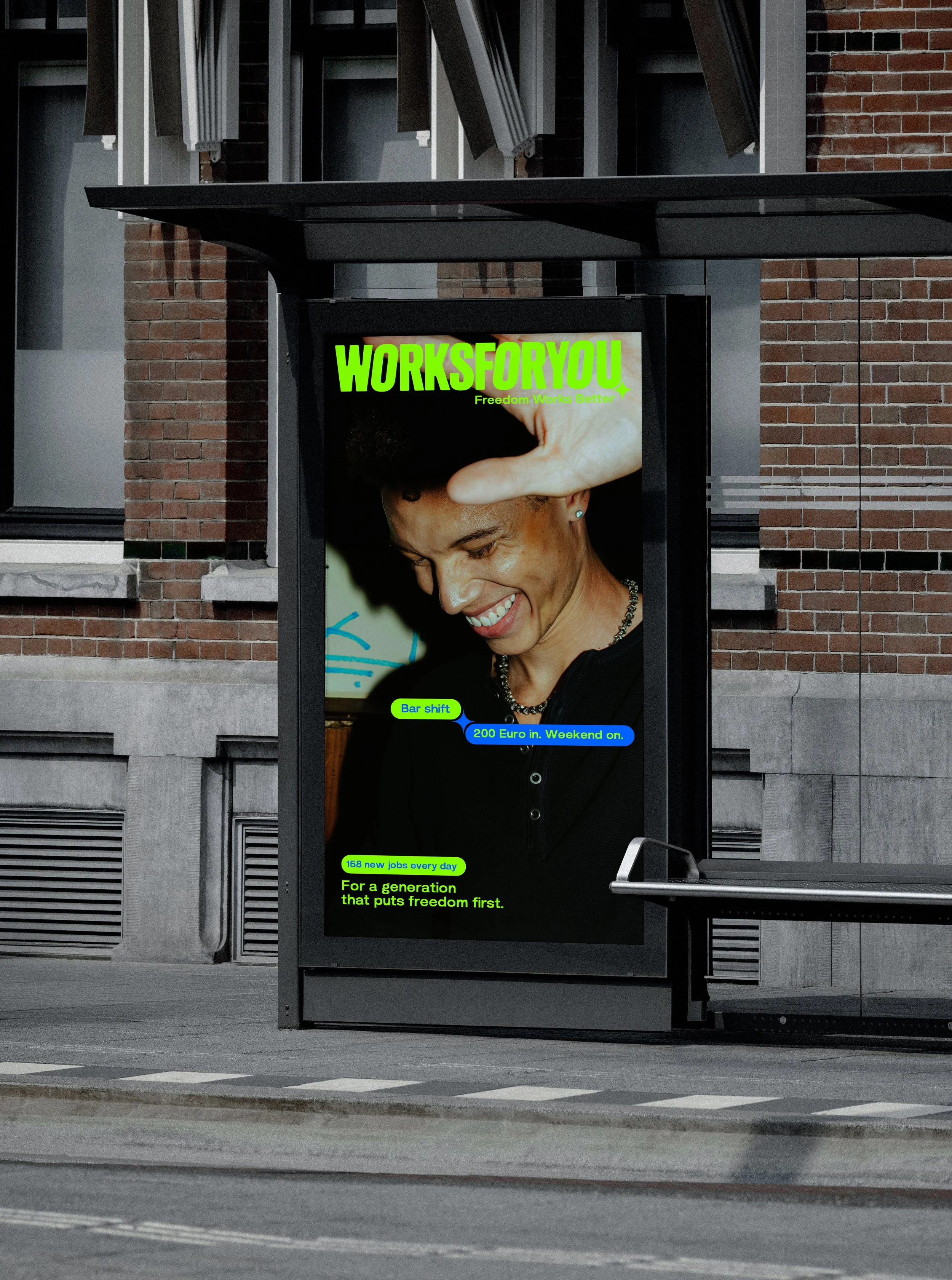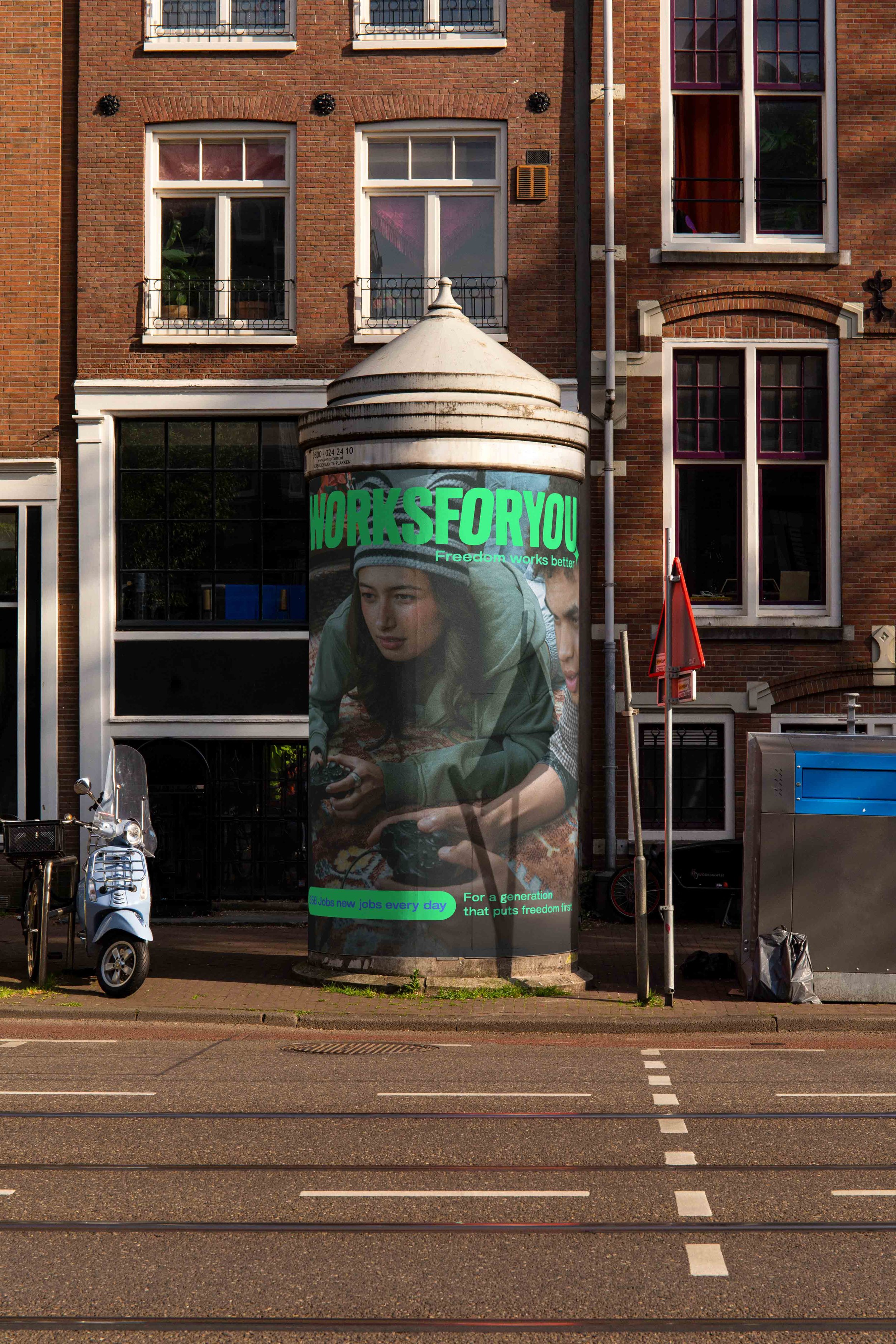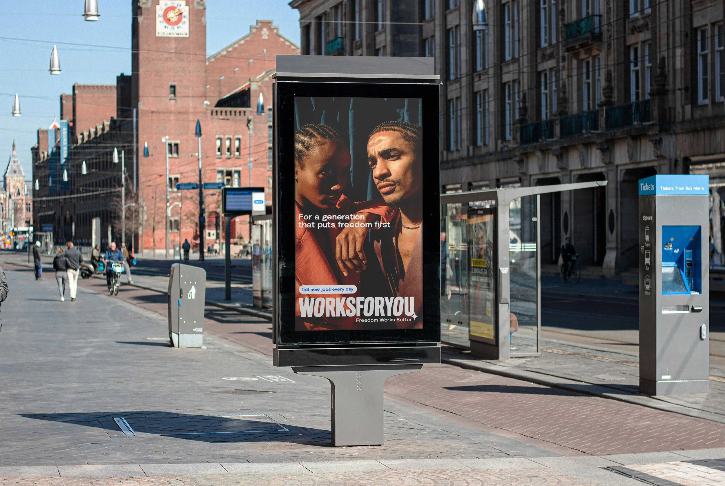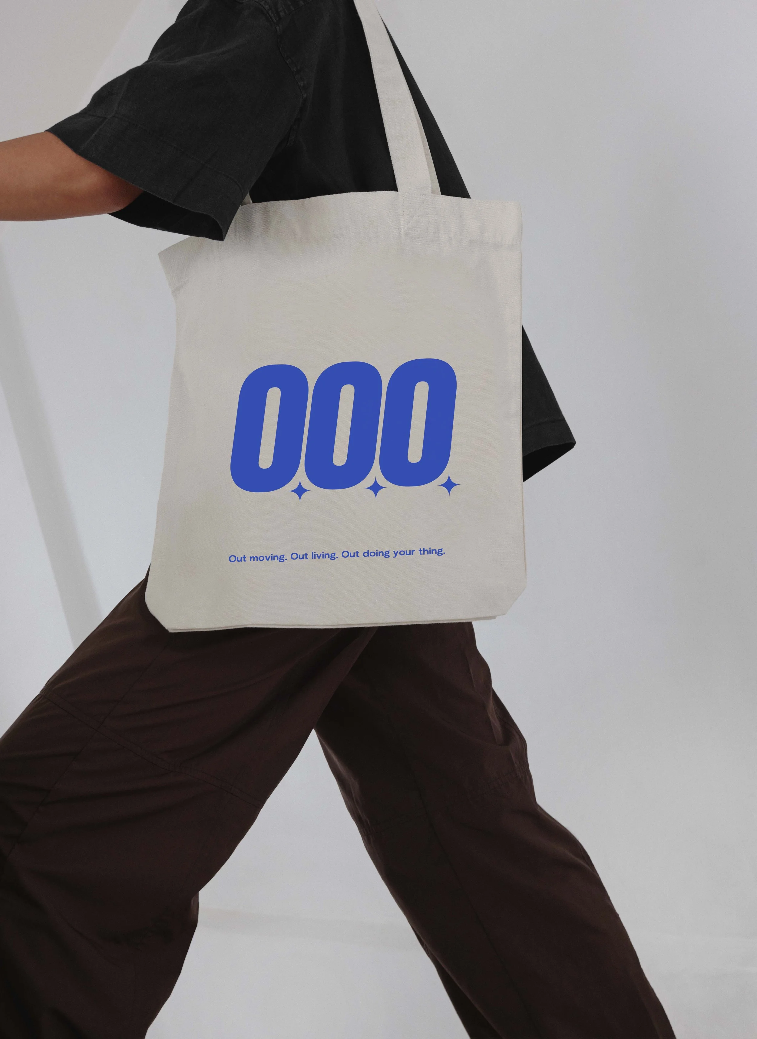
Background
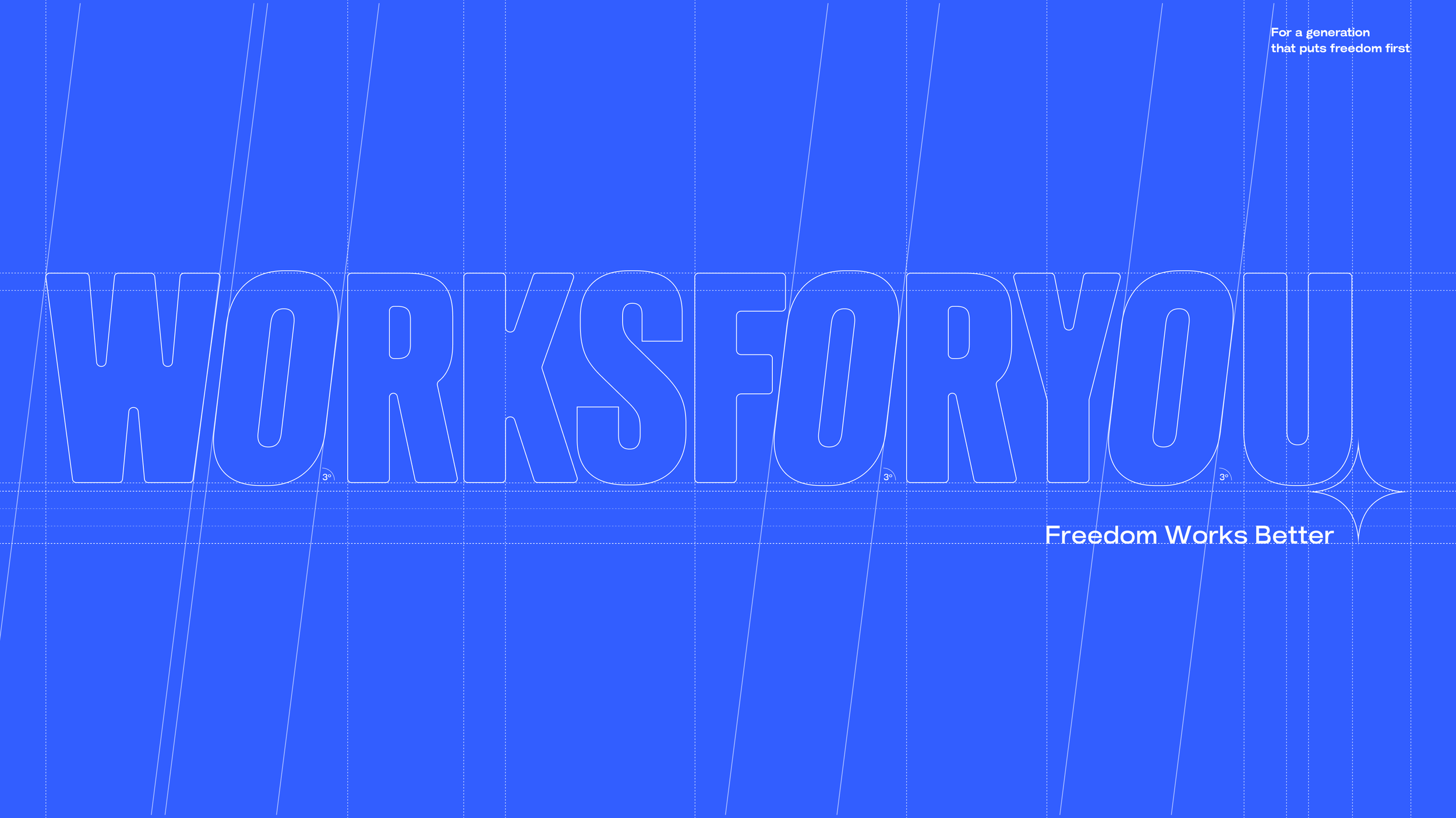
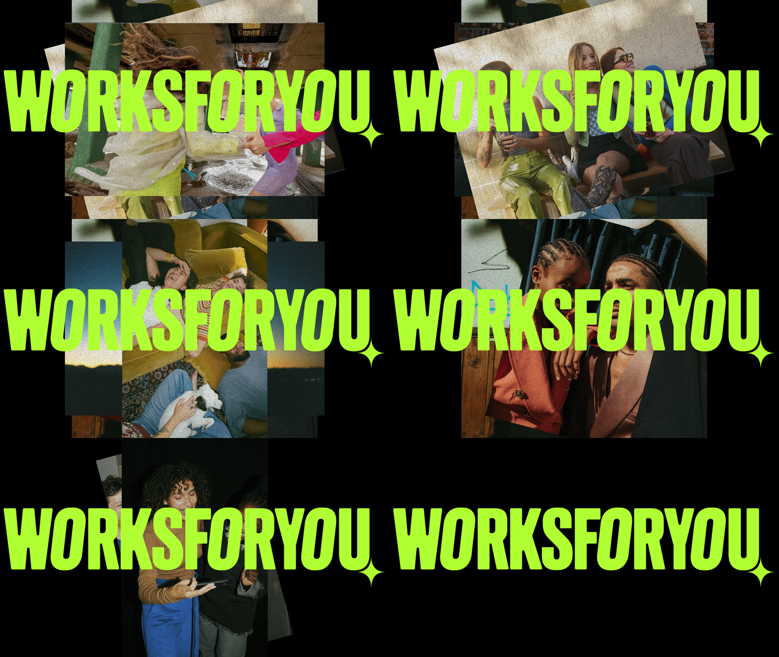
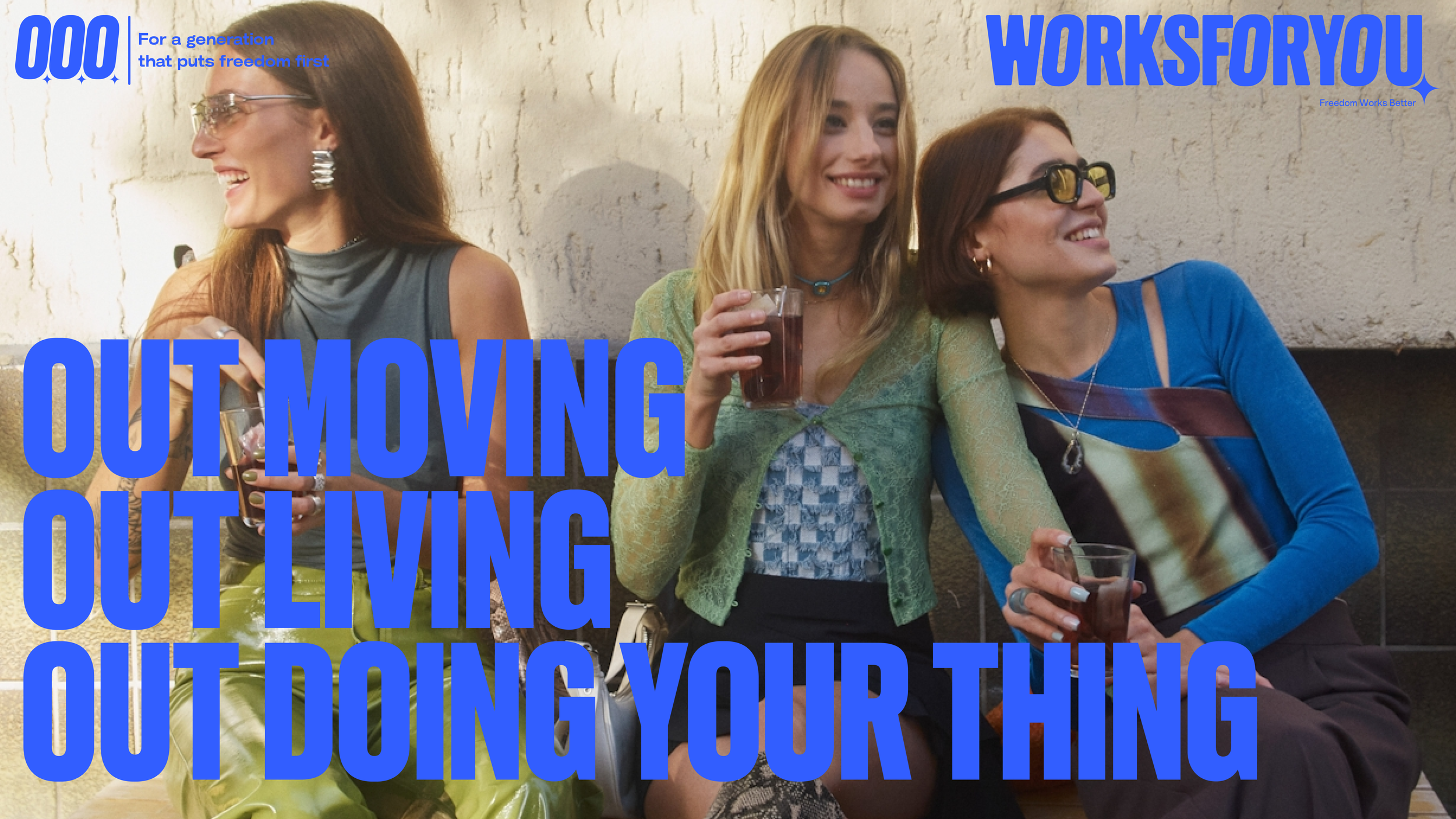
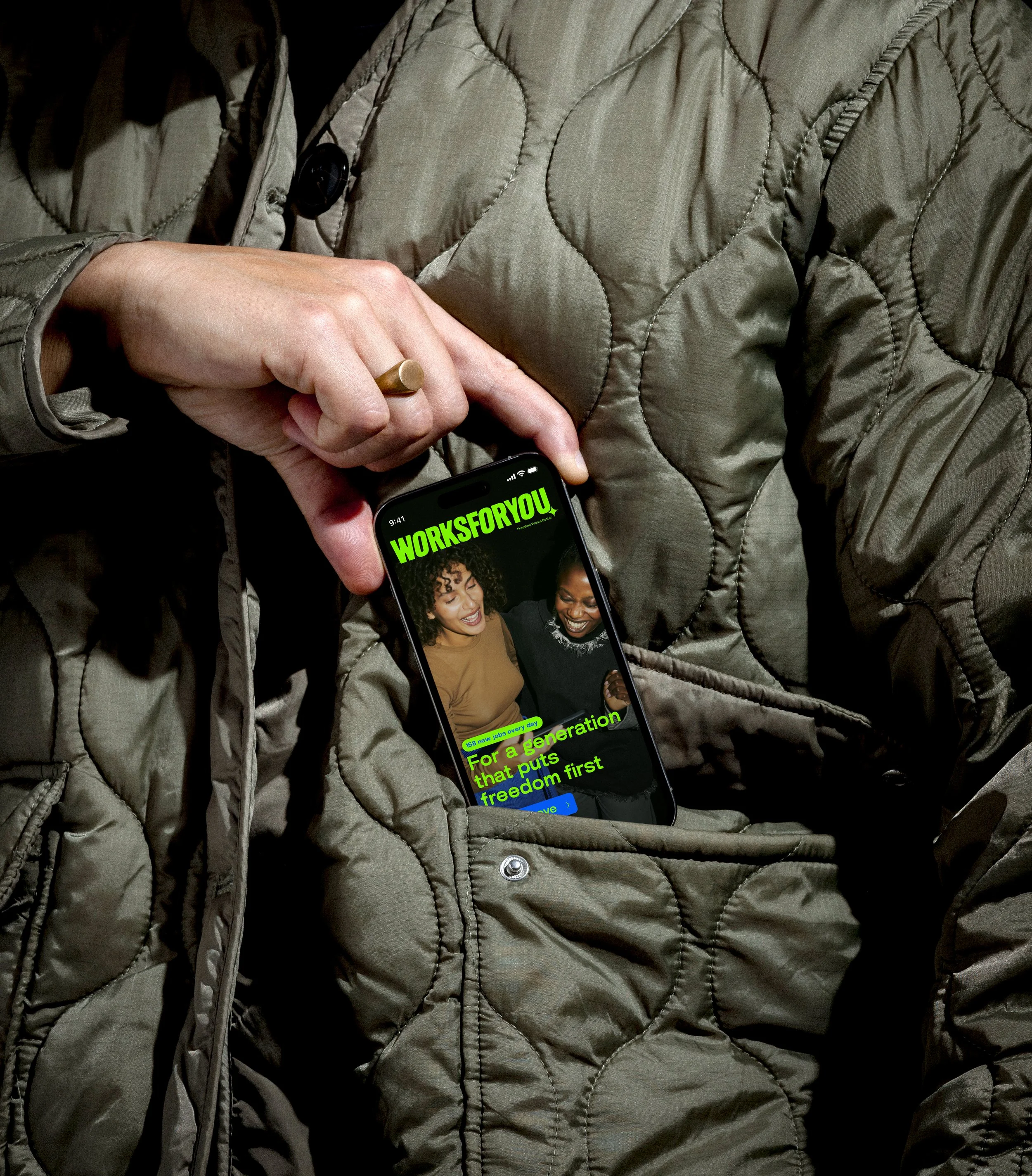
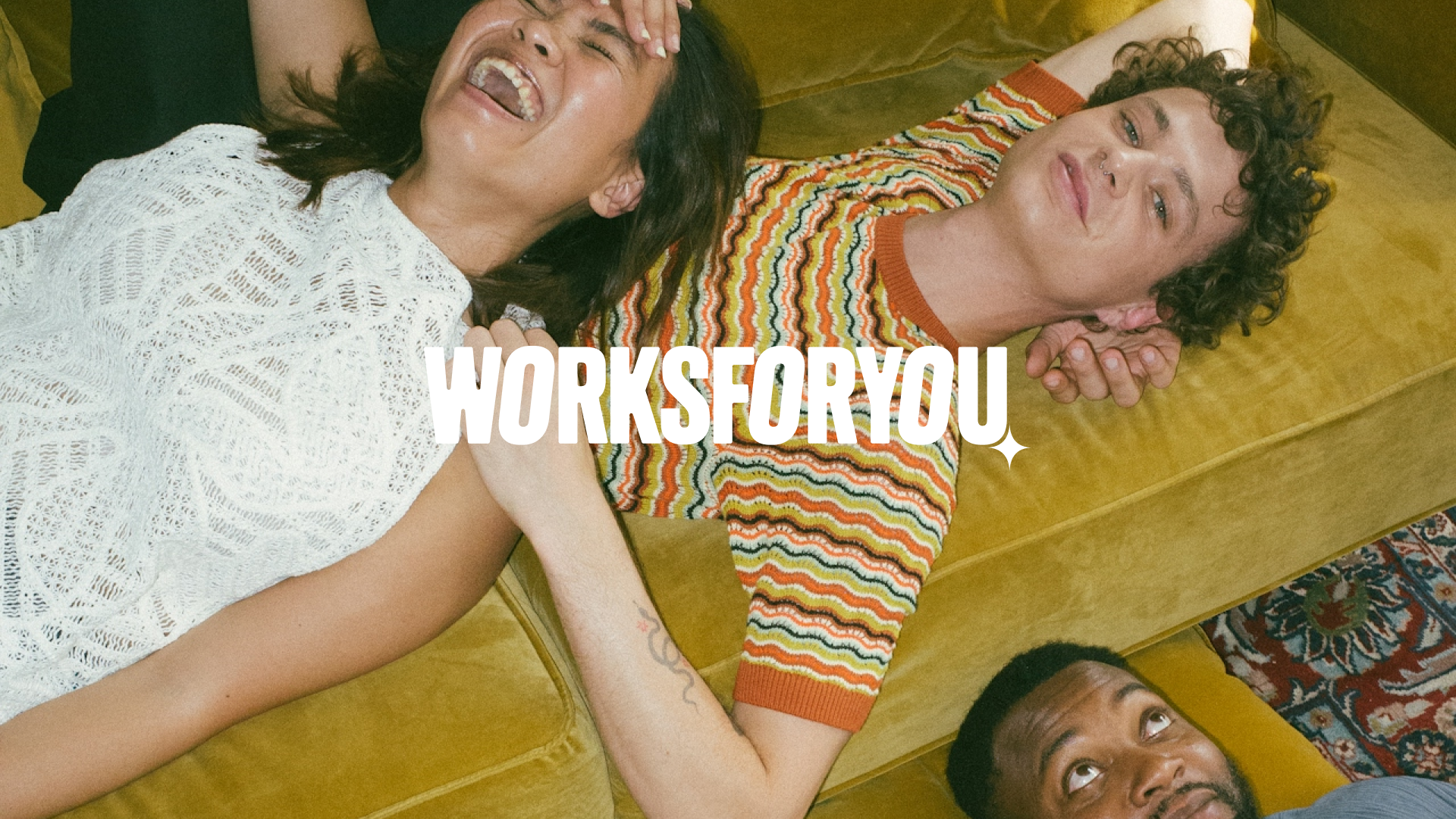
WeAreBrain approached me to guide the brand strategy and creative direction for the job platform Worksforyou. The task was to define a vision and creative direction that seamlessly aligns with the core values of Gen Z.
Client
Worksforyou
Agency Network
WeAreBrain
Neverland
Year
2026
Team
Fabrizio Di Bon – Creative Director
Elvire Jaspers – Client Lead
Anastasia Gritsenko – Development
Thuisarts is the Netherlands’ leading health information platform, reaching nearly 80 million visits annually.
As the platform scales, so does the complexity. Fragmented touchpoints, rising expectations, and the rapid emergence of AI makes it clear: Thuisarts needs a unified, future-facing vision that can align every channel and product.
Over an in total 16-month trajectory, I guided the organisation in defining that direction. From shaping the overarching business and brand strategy to leading hands-on workshops and developing a cohesive identity system. Leading a multidisciplinary team of strategists, designers and developers, we built a foundation designed to scale, adapt and stay relevant in a fast-evolving healthcare landscape.
Brand Existence
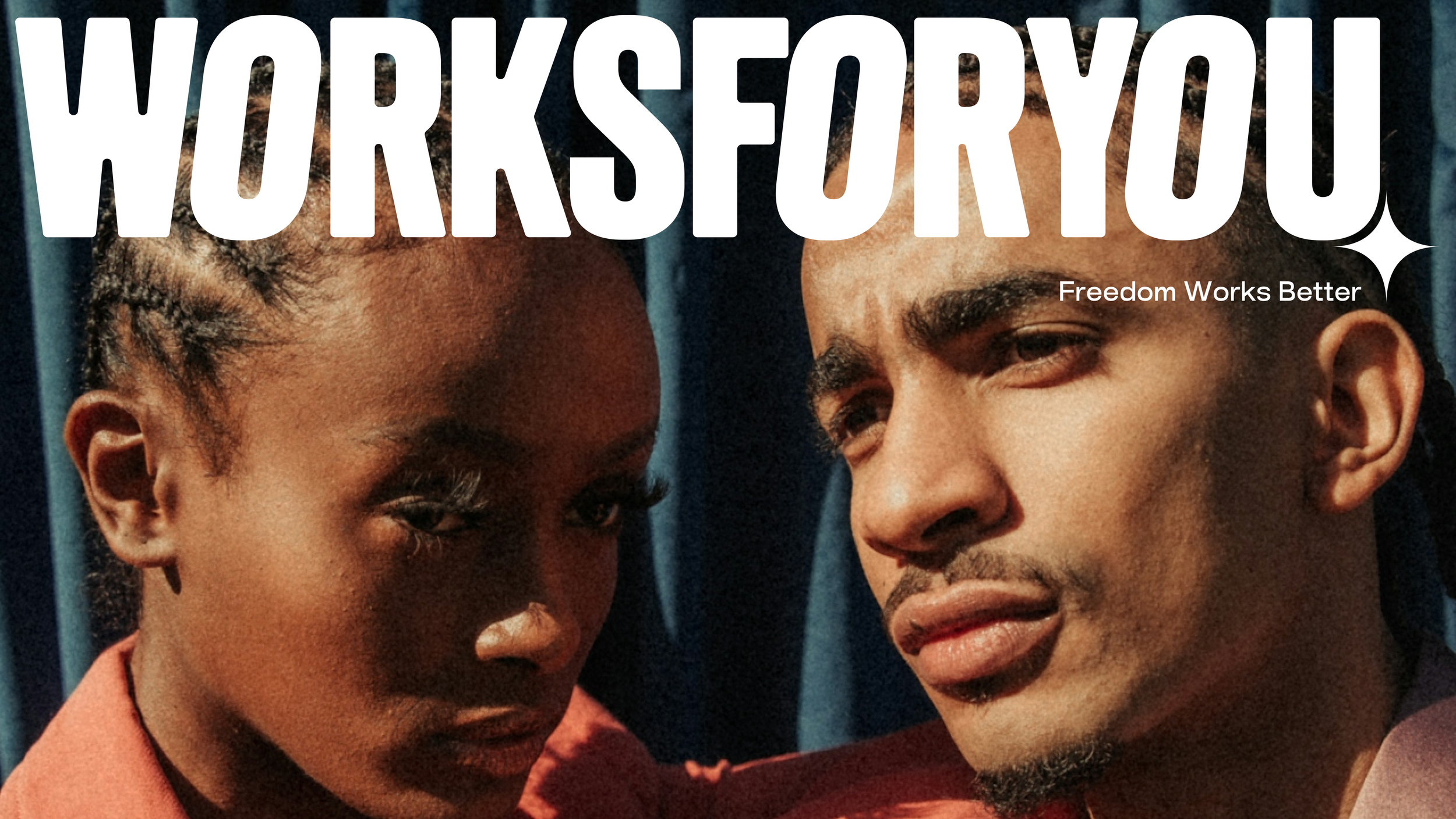
WHY — Freedom works better
WorksForYou exists because work should create freedom, not take it away. We believe young people deserve fair opportunities, real choice and transparency. And businesses deserve the same clarity and trust when finding great people.
HOW — People first. Always moving
We keep things human, move fast and never compromise on quality. From first match to getting the job done, we make the whole experience work smoothly for people and businesses alike.
WHAT — The right people for the right job
We connect businesses with people who are ready to go, while giving a new generation the freedom to find work that fits their life, their plans and their terms.
Values
FREEDOM — Freedom to choose
You decide what works for you. The freedom to move fast, stay flexible and choose your own path.
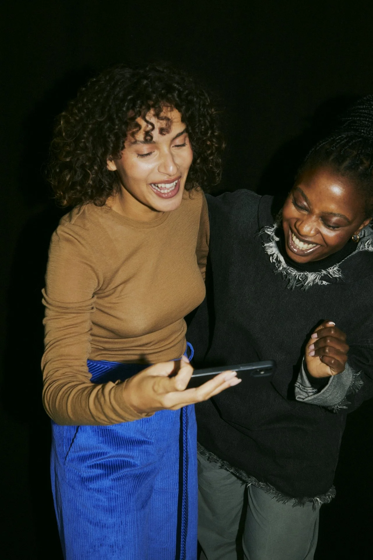
ALWAYS IN MOTION — Ready when it matters
We stay close, connected and always moving. So we can move fast and be there when it matters.
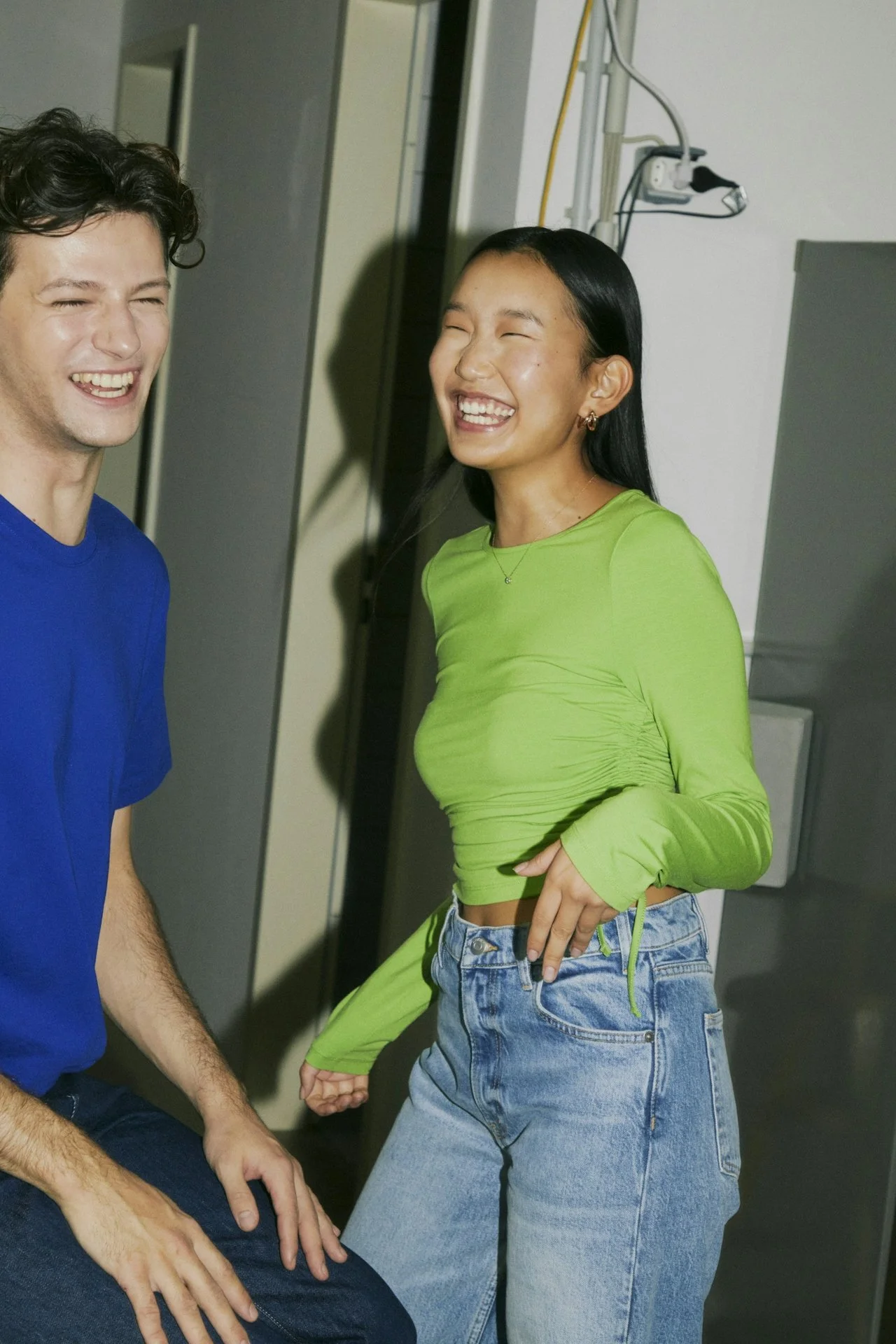
HUMAN — No bullshit
People first. Always honest and transparent. No games, no unnecessary hassle. Just real people making things work.
Design Principles
Trust in simplicity
Our design language is minimal and clear. We make deliberate choices, using form and language that are purposeful and impactful. This creates a fresh, forward-looking aesthetic without unnecessary complexity.
Better together
People and healthcare professionals are at the heart of our visual language. We choose imagery that captures real emotions, feels grounded in everyday life, and invites people to see themselves reflected in it.
Clear for everyone
We present information in a structured and easy-to-follow way, making it simple to understand. A high-contrast colour palette ensures strong readability and visual clarity across every touchpoint.
Tagline
At Thuisarts, we set out to make reliable health information instantly accessible and easy to navigate. The tagline captures that promise in a way that feels clear, human and direct.
Built around a simple, familiar behaviour, it puts people first. Whether you have a question, a concern, or just want reassurance, Thuisarts becomes the natural starting point.
Concise and memorable, the line positions Thuisarts as the first place you turn to. Its rhythm makes it stick and allows it to spread organically, becoming part of everyday language.
Over time, the system is designed to evolve with its audience, gradually distilling the message until only one word remains: check.
Thuisarts.
The first place you check
2026
Thuisarts.
The place you check
2028
Thuisarts.
Check
2030
Visual Identity – Logo Design
A Logo for Everyone
The Thuisarts logo mark reflects a system built on care and collaboration. It visualises how information flows between people, professionals and the platform.
Rooted in the existing identity, the mark has evolved rather than changed. By building on familiar elements, it remains recognisable and trustworthy for existing users, while opening up space for a more future-ready expression.
Rather than representing fixed roles, the shapes express a continuous exchange. Thuisarts acts as the facilitator, guiding and filtering interactions to surface what truly matters.
The outcome is what counts. Information becomes relevant in context, shaped by need, knowledge and moment. The system adapts, always moving to deliver the right information, at the right time, to the right person.
Visual Identity – Typeface Design
A typeface built for clarity and scale
Together with Rodrigo Fuenzalida from Fragtype, we developed a custom typeface to unify the Thuisarts experience across every platform and touchpoint.
Designed for simplicity and readability, the typeface performs effortlessly in long-form content, while retaining enough character to stand out in more expressive contexts such as out-of-home communication.
Spanning from Thin to Black, the type family offers the flexibility to support both calm, information-driven interfaces and more distinctive brand moments.
Visual Identity – Graphs and numbers
Visual Identity – Illustration style
An illustration style that bridges generations
Together with the Dutch illustrator Thomas Rohlfs, we developed an illustration direction that connects with both younger and older audiences.
The style takes cues from the visual language of ’70s and ’80s comic books, creating a sense of familiarity for older users, while feeling fresh and distinctive for a new generation.
By balancing nostalgia with clarity, the illustrations remain approachable, expressive and easy to understand. They support the content without overwhelming it, helping people quickly recognise situations and navigate information with confidence.
Platform
A Digital Platform Revamp
Skills
Brand Identity Design
Brand strategy
Brand storytelling
Co-creation
Creative direction
Digital design
Design systems
Experience design
Film direction
Graphic design
Product development
Photography direction
UI / UX
Team
Ux Designer
Ui Designer
Typedesigner
Illustrator
Brand Designer
Copywriter
Art Director
Motion Designer
Credits
Agencies
Reaktor
Neverland Amsterdam